We’ve all heard the idea that if you reach a certain percentage of immunity in a population, you achieve herd immunity. But what if it’s not just about the percentage? What if how people are connected plays a huge role too? This is what our new PNAS paper is all about—how herd immunity, whether from natural infection or vaccination, interacts with our social networks.
Every epidemic intervention, such as vaccination, mask mandates, school closures, and contact tracing, that we apply to a population usually influences some local properties of our social network by altering the connections or interactions between people. These local effects then propagate throughout the entire network, and depending on the population’s structure, they either get amplified or eventually fade away, leaving the intervention almost useless. We model social networks with random graphs. In this picture, every person is represented by a node (a point in space and maybe in time), and a link (a line segment) between two nodes represents a contact or connection between two people. A collection of nodes with some specific connection pattern represents an ideal who-contacts-whom map of the population. An epidemic intervention changes the contact pattern of such random graphs.
Herd Immunity Thanks to Vaccination
Take vaccination as an example. In the simplest scenario, with a perfect vaccine, we immunize the vaccinated individuals and block the transmission routes to their neighbors, which means removing a certain number of batches — nodes with their connecting links — from the original network. Sometimes, these batches form larger batches and together, dismantle the network. This phenomenon is known as percolation in scientific jargon. We say immunity has percolated through the target population if, with sufficient vaccination, every local infection dies out as it is contained within its neighborhood. The benefit of vaccination is twofold. First, some people gain immunity as a direct effect of vaccination (removed nodes), and second, the remaining unvaccinated people, despite not being directly immunized, gain protection by being disconnected from the infection routes. In practice, the challenge remains to determine how many people and in what order and pattern we need to vaccinate to achieve population-level immunity, or, in epidemiological terms, herd immunity.
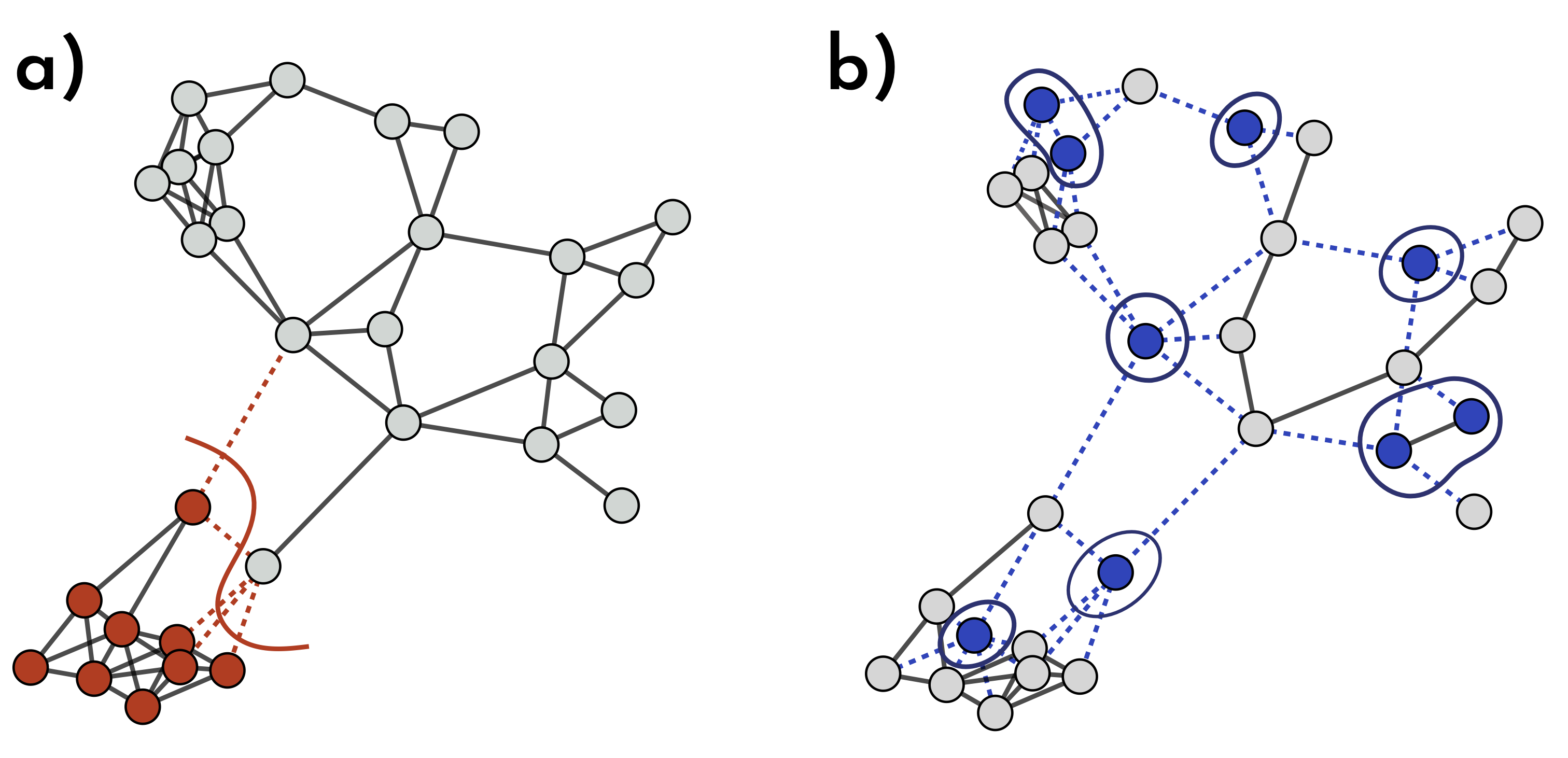
Fig. 1: How Different Immunization Strategies Protect the Network. In (a) & (b), the same number of nodes is immunized, but their placement makes a big difference. In (a), immune nodes (red) form a close batch, blocking only a few virus pathways (dotted red lines) and providing limited extra protection. In (b), vaccinated nodes (blue) are scattered across the network, removing a more spread-out batch of nodes and links. This scattered setup disrupts many more transmission routes, giving the entire network stronger, broader immunity.
A simple way to find the herd immunity threshold is to consider exponential growth for the early stage of an epidemic, where each infected individual, on average, infects $R_0$ more people. Now, if we randomly vaccinate a fraction $v$ of the population, the number of secondary infections, $R_{e},$ becomes $R_{e}=(1-v)R_0$, meaning each person now infects $vR_0$ fewer people. If $R_{e}$ falls below one, instead of exponential growth, we see a decline, and the disease quickly dies out. So, the herd immunity threshold is the fraction $v_c$ that satisfies this equation $1=R_0(1-v_c)%$. Solving this gives the threshold: $$v_c = 1 – \frac{1}{R_0}.$$

If we set $R_0=3$, as some studies did early in the COVID-19 pandemic, the equation above gives $v_c = 1 -1/3 \approx 0.7$. This might ring a bell, as you may have heard about the 70% vaccination target for reaching herd immunity in the media. In mathematical epidemiology, $R_0$ is known as the basic reproduction number, and $R_e$ is called the effective reproduction number. This reasoning has been widely used to estimate the herd immunity threshold.
However, we now understand that this approach needs to be revised in many instances because it oversimplifies the complexities of real-world scenarios. This model assumes that everyone has an equal chance of interacting with anyone else, regardless of their location, occupation, age, or interests. In reality, we do not live in a giant cocktail shaker where we constantly bump into one another. We interact with people around us in different ways and at other times. Our social and health behaviors significantly affect the outcome of epidemic spread and can hinder the effectiveness of interventions. To consider these complexities, we need to put the networked structure of the human population in our modeling assumptions. Let’s follow a yet simple but more realistic approach.

Fig.3: In a fully-mixed population, everyone can interact with everyone at any time! In reality, however, we do not live in a giant cocktail shaker where we constantly bump into one another!
Imagine a population where people have different numbers of connections, and vaccinated individuals are more likely to interact with other vaccinated people, while unvaccinated folks also tend to stick to their own group. This is a familiar scenario: in most populations, vaccine uptake doesn’t result in a perfectly even distribution. There are often vaccine-hesitant individuals who primarily engage with others who share their views. This social tendency, where similarity drives connections, is known as homophily in sociology. “Birds of a Feather…” and all that.
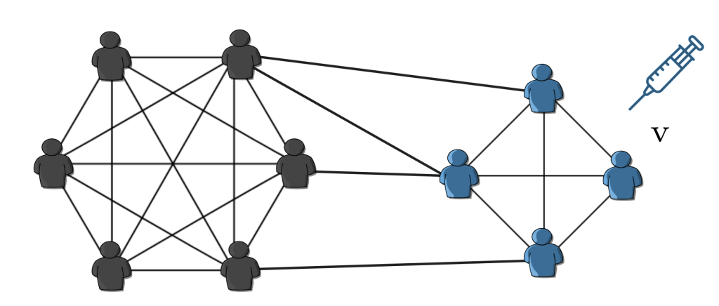
Fig. 4: A more realistic transmission network where each person interacts with a different number of individuals, and interactions are more likely to occur between people with the same vaccination status. This network has a positive Coleman homophily index based on the vaccination.
We can measure the degree of vaccine homophily, $h$, based on the fraction of vaccinated people and the likelihood that a vaccinated person connects with either vaccinated or unvaccinated individuals. The homophily value, also known as the Coleman homophily index, ranges from -1 to 1. When $h=0$, people interact regardless of their vaccination status. A positive $h$ indicates a preference for same-status connections, with larger values reflecting a more substantial bias. Now, the question arises: given this specific pattern of connections controlled by $h$, how does our previous equation for the herd immunity threshold change? Researchers at Aalto University in Finland have shown that incorporating these nuances into the model modifies the herd immunity threshold equation to $$v_c = \frac{1}{1 – h}\left(1 – \frac{1}{R_0}\right).$$ To understand this equation, let’s first set $h = 0$, representing a fully mixed population with no preference in interactions. This returns the original equation, assuming vaccines are evenly distributed. It implies that, as long as $R_0$ is known, we can calculate the epidemic threshold regardless of the connections between individuals. However, when $h \neq 0$ , things change significantly. Fig. 5 shows how the herd immunity threshold varies with different $R_0$ values as a function of vaccination homophily. For example, in a population with $h = 0.5$ when $R_0 = 2$, the herd immunity threshold reaches 1, meaning every single individual must be vaccinated to achieve herd immunity. When vaccination homophily exceeds $1/R_0$, herd immunity becomes unachievable as indirect protection diminishes entirely.
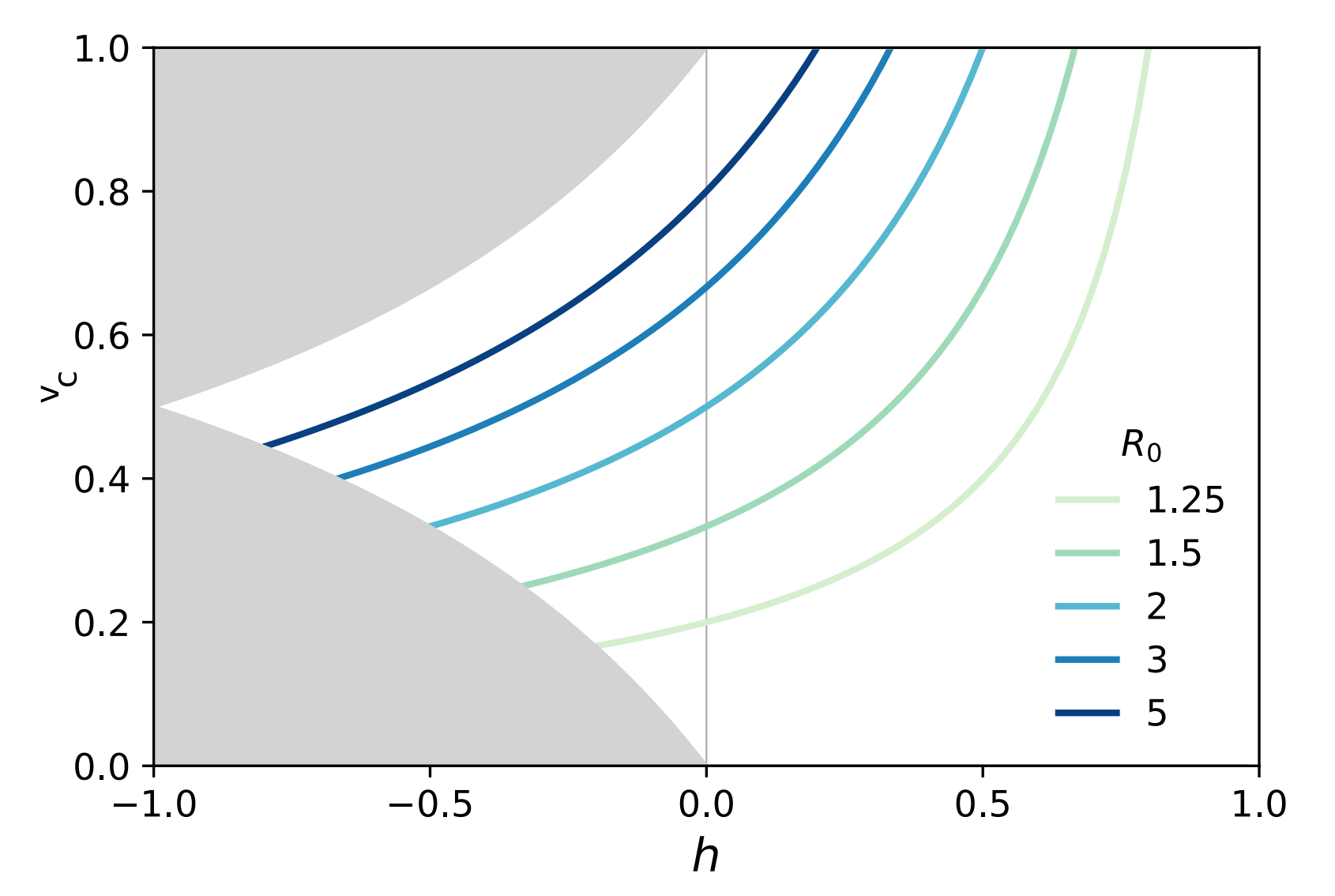
Fig. 5: As vaccination homophily increases, the herd immunity threshold rises, eventually reaching a ceiling. This indicates that there is no indirect benefit from vaccination beyond a certain point, when $h \geq 1/R_0$, meaning herd immunity becomes unattainable.
This approach, while more realistic than the previous one, still doesn’t fully capture real-life complexities. However, it provides a foundation for understanding herd immunity and helps generate more refined research questions. Models that assume uniformly random connections between individuals—ignoring how people are actually connected—are called mean-field models. By averaging out individual differences, they treat everyone as equally likely to interact with anyone else. While this simplification is useful for deriving general insights, it overlooks the finer details of network structures, where social dynamics, proximity, and individual connectivity significantly influence the spread of immunity and disease. We’ll revisit these concepts later.
Herd Immunity Thanks to Natural Infection
Think of herd immunity as a firewall: the more individuals in a population who are immune, the more difficult it is for the disease to reach those who are vulnerable. This protection is nonlinear—each additional immune person often enhances the firewall, providing even greater protection for everyone. In addition to vaccination, herd immunity can also be achieved through natural infection. Vaccination introduces a weakened or inactive form of the pathogen, or, in the case of mRNA vaccines, a genetic blueprint that instructs cells to produce a harmless protein, thereby stimulating an immune response. Natural infection, on the other hand, occurs when people contract an illness and develop immunity after recovering. In both cases, each node gains a sort of immunity memory, which may wane after some time.
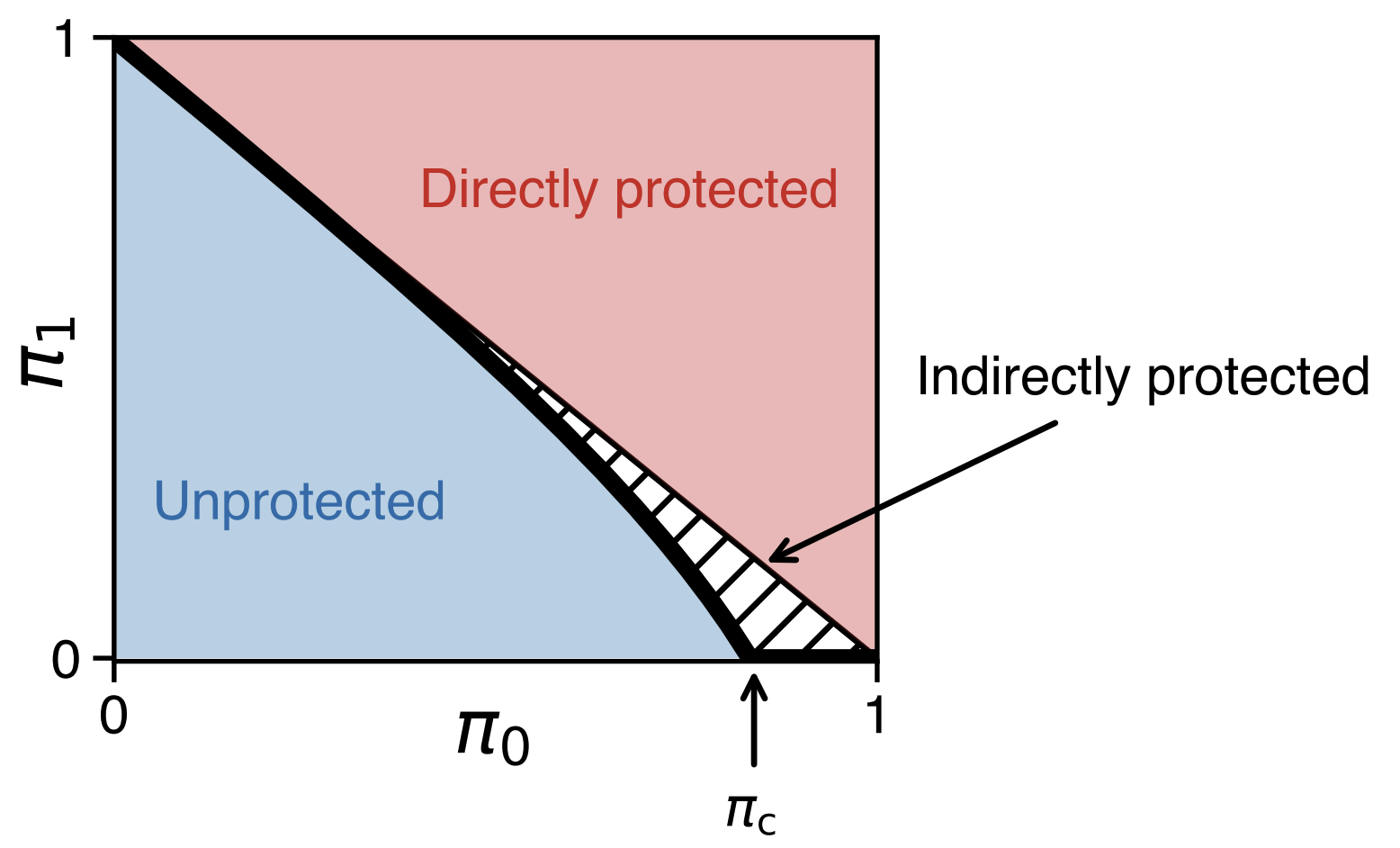
Fig. 6: Herd immunity is larger than the sum of individual immunities. The horizontal axis ($\pi_0$) shows the fraction of immune people, while the vertical axis ($\pi_1$) represents the size of the largest connected group still at risk of infection—think of $\pi_0$ and $\pi_1$ as the potential number of people infected in the first and second waves of the epidemic, respectively. At a certain immunity level, $\pi_c$, the disease can no longer easily spread, creating a ‘herd immunity’ effect where even non-immune individuals are protected.
Vaccination and natural immunity typically operate differently in a network. Take another look at Fig. 1. In panel (a), we see a scenario resembling immunity acquired through recovery: the infection likely started near the bottom of the network, spreading to neighboring nodes as it progressed. In contrast, panel (b) doesn’t reflect natural immunity since there’s no clear path between immune nodes. Instead, this pattern suggests immunity from an external factor, like vaccination. Although both networks have the same number of immune nodes, the level of protection across the network differs. Kermack and McKendrick, in their seminal paper, derived a mathematical expression for disease-induced herd immunity, showing that an epidemic of a disease that grants immunity upon recovery can end before the entire susceptible population is infected. Without considering any network structure, disease-induced and vaccination-induced herd immunity are mathematically equivalent. However, this equivalence falls apart when contact patterns are not homogeneous.
Networks are all about connections—some people, like social butterflies, have many connections, while others have fewer, closer bonds. This variation, known as degree heterogeneity, refers to the fact that specific individuals, referred to as superspreaders, can infect a large number of others if they contract a disease. Connections are also not entirely random; they’re influenced by physical proximity. People who live or work near each other are more likely to be connected, a concept called spatiality. As Tobler’s First Law of Geography says:
Everything is related to everything else, but near things are more related than distant things.
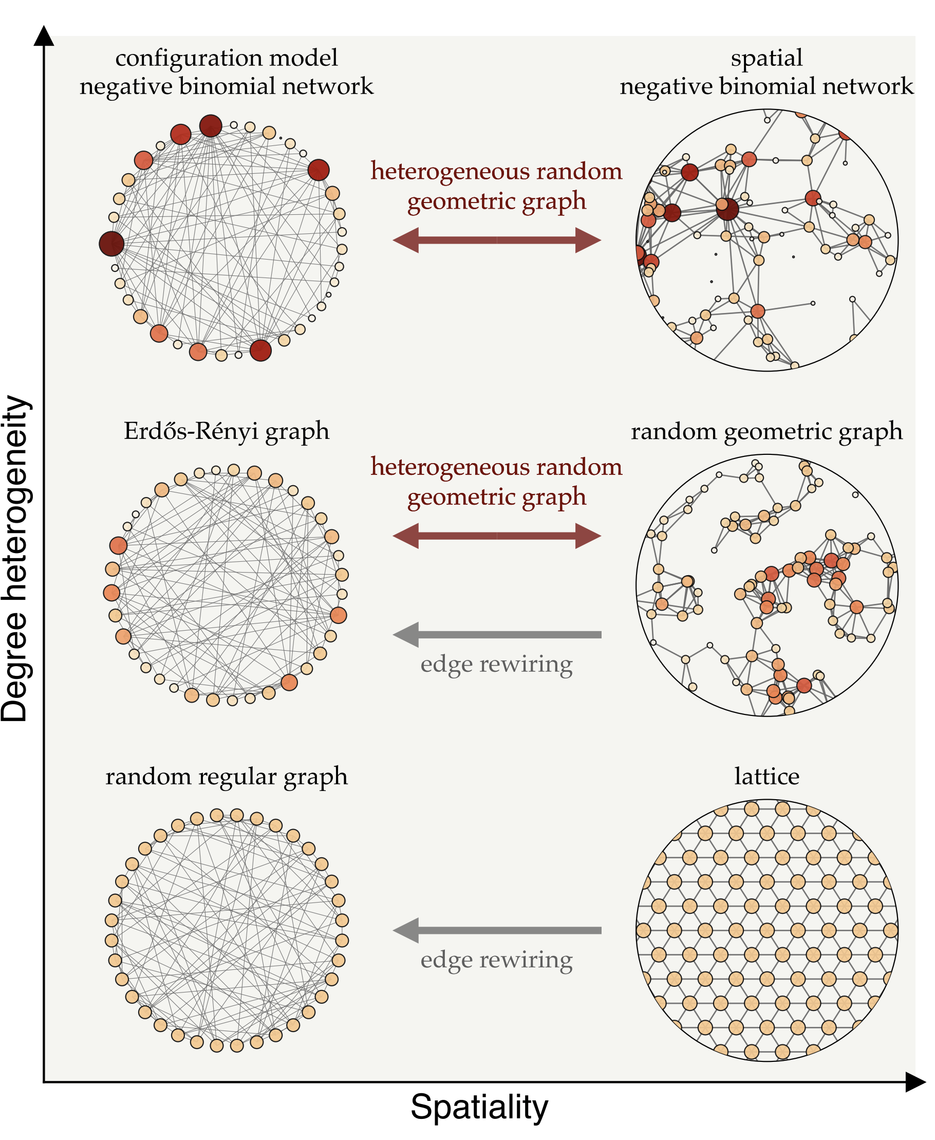
Fig. 7: Different types of network models, positioned according to their degree-heterogeneity (vertical axis) and spatiality (horizontal axis). Degree heterogeneity captures the range of connections individuals have—from highly connected hubs to those with few links—while spatiality represents how much connections are influenced by physical proximity.
We can transition between these network types using mathematical techniques that adjust their heterogeneity and spatiality. For instance, edge rewiring increases randomness in connections while preserving the network’s degree structure, while other methods introduce spatial constraints without altering degree variations. These models enable us to investigate how network structure influences the spread of immunity and disease.
On the left side of Fig. 7, we see a range of network models where connections aren’t constrained by proximity, but instead vary in terms of degree heterogeneity. The top-left model, known as the configuration model, is particularly useful for representing superspreaders—individuals with an exceptionally high number of connections, often referred to as infection hubs. This framework allows us to simulate populations with a wide variation in connections, where a few superspreaders are highly connected and play a key role in disease transmission. In network models that allow for such degree heterogeneity, hubs are more likely to become infected early due to their numerous connections, and once recovered, they no longer fuel the epidemic, which can significantly slow disease spread. This suggests that, assuming infection is not overly harmful, disease-induced immunity can be more effective than random vaccination in such networks. Random vaccination is less likely to target superspreaders, leaving them susceptible and enabling them to continue spreading the disease. Therefore, there are mathematical and data-driven studies suggesting that disease-induced immunity offer an advantage over vaccination by targeting superspreaders who drive transmission.
Early in the COVID-19 pandemic, Sweden adopted a strategy that minimized interventions, aiming to allow natural immunity to develop through superspreaders and enhance overall population immunity. However, this approach faced significant challenges, leading Sweden to reassess and adjust its policies. One reason for its shortcomings was that degree heterogeneity—variation in the number of connections—is just one of many factors that influence the spread of epidemics. It turns out that disease-induced immunity is driven not only by the concentration of immunity among socially active individuals, as already identified in mean-field models, but also by another counteracting mechanism inherent to network models.
The Spatial Blueprint of Immunity in Networks
As we show in our new paper, while superspreaders do give disease-induced immunity a clear edge, that’s only part of the story. Our mathematical investigation into herd immunity reveals two competing mechanisms: preferential immunity and localization. Preferential immunity occurs when highly connected individuals—superspreaders—are more likely to get infected early, which can actually strengthen herd immunity. Once immune, these individuals act as a firewall, limiting the disease’s ability to spread widely. Localization, however, refers to outbreaks clustering in specific areas, causing immune individuals to group together. This clustering reduces the overall protective effect of immunity on the broader population. When people are physically close, they’re more likely to catch the disease from each other, making disease-induced immunity less effective in these networks.
When we look at the way people are wired together, many connections are shaped by physical proximity—such as in households, workplaces, or neighborhoods—which amplifies the localization effect and limits the protective reach of immunity across the broader population. The right side of Fig. 7 illustrates spatial network models where connections are more likely to form between physically close people. In homogeneous networks, where individuals have roughly the same number of connections, localization tends to outweigh the benefits of preferential immunity. In such cases, random vaccination often proves more effective than natural infection for achieving herd immunity, as it distributes immunity more evenly across the network. However, in more heterogeneous networks—where some individuals have significantly more connections than others—disease-induced immunity gains an advantage. When highly connected individuals become infected and then immune, they can help slow transmission. Still, localization remains a factor, as outbreaks can cluster within certain areas, limiting the network’s overall protective effect.
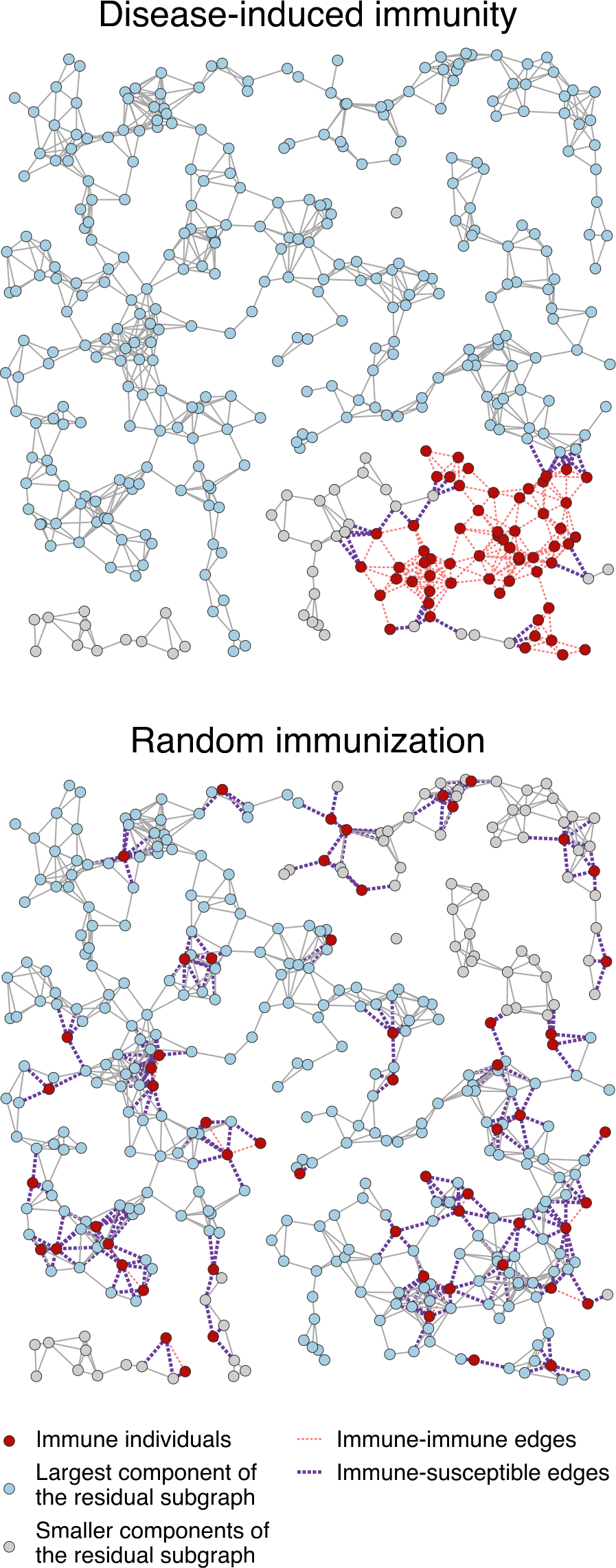
Fig. 8: Comparison between the distributions of the same number of immune individuals (nodes) induced by an epidemic and by vaccination (random immunization) in a random geometric graph.
Random geometric graphs bridge the gap between purely random graph models and real-world networks with spatial constraints, providing a useful framework in various fields, from communication networks to biology and epidemiology.
This illustrates how disease-induced immunity propagates through a network, with red dots representing immune individuals—those who have recovered from infection and can no longer transmit the disease. The blue dots are still susceptible and make up the largest connected group at risk of an outbreak. Gray dots represent smaller groups of people who are more isolated from the main network.
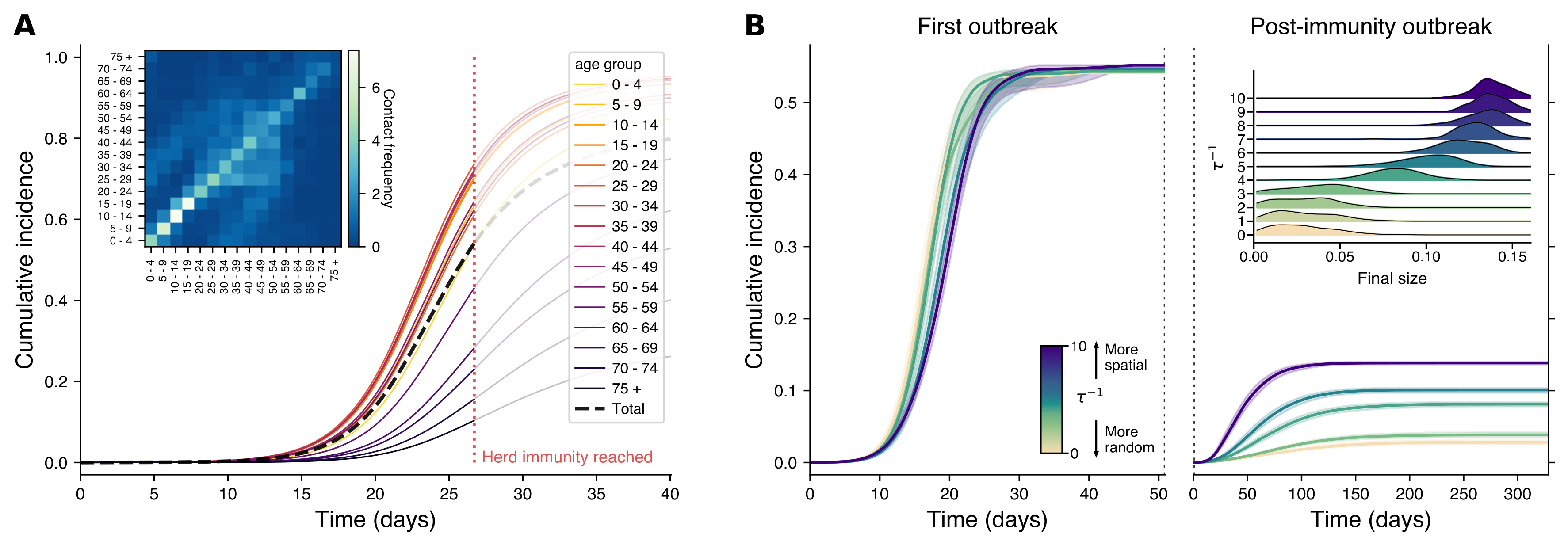
As part of the Nordic Pandemic Preparedness Modelling Network—a Nordic collaboration focused on creating data and modeling tools to support pandemic preparedness—we tested this spatial approach using real-world data from Finland. We created a realistic social network that accurately reflected life in Finland, incorporating age structure and interactions among different age groups. Simulating an epidemic on this network, we found that even after reaching what traditional models would consider the herd immunity threshold, the disease could still resurge, particularly in networks with strong spatial organization.
pnas.2421460122#fig04
Panel A of Fig.9 shows a traditional model that treats the population as if everyone mixes evenly, with cumulative cases tracked by age group. The black dashed line shows total infections over time, and the red dotted line marks when herd immunity is theoretically reached. The inset displays how often different age groups interact in Finland. In Panel B, we see a more realistic network model based on the Finnish social network, where people are more likely to connect with those nearby. The left plot shows the initial outbreak, while the right captures what happens if the disease is reintroduced after reaching herd immunity. The colors represent different levels of ‘spatiality’ in the network: light colors show more random mixing, while darker colors represent networks where people stick closer to home. The inset on the right shows that even with herd immunity, localized outbreaks can still happen, especially in more spatially organized networks. The spatial structure is represented by varying $\tau^{-1}$ values, from random (light colors) to highly spatial (dark colors), with shaded areas representing the 95% confidence intervals across simulations.
So, what does this mean for the debate between vaccination and natural infection?
The key takeaway is that neither approach is universally better—it all depends on the network structure. In more uniform (homogeneous) networks, random vaccination tends to be more effective for achieving herd immunity, while in highly varied (heterogeneous) networks, disease-induced immunity can offer certain advantages by naturally targeting superspreaders. The reality lies in between. To improve public health models, we need to consider network structures, as traditional models often underestimate the immunity levels required for herd protection. Understanding real-world social connections can make vaccination campaigns more effective by using network analysis to identify high-risk communities or individuals. This enables more strategic, data-driven interventions, targeting those most likely to drive transmission and optimizing resource allocation.
Read the supporting material for this post here:
- Strength and Weakness of Disease-induced Herd Immunity in Networks, PNAS
- Herd Immunity and Epidemic Size in Networks with Vaccination Homophily, Phys. Rev. E 105, L052301
- Spreading and Epidemic Interventions: Effects of Network Structure and Dynamics, PDF & More


